The top screengrab shows how we made some of the shots black and white, specifically in the behind the scenes shots in our video. The other two shots show how we created the light bulb and sun effects to merge them together when we faded to the bedroom, scene of the girl.
Wednesday, 30 November 2011
Sunday, 27 November 2011
Thursday, 24 November 2011
Filming
Today we went filming again, we re-shot the park scene as the performance was not good in our previous shoot. We got all the shots we needed and we also included the end of the narrative scene in it as it was in the park. The weather wasn't as good as our previous shoot of the park scene, however I think it will fit in and not cause a problem for our video.
Saturday, 19 November 2011
Vernallis analysis of a music video
I chose to analyse this particular music video because it was one of the many videos that inspired many of our shots in our final cut of 'Better Together'.
Narrative: There are two locations for the narrative sections of the video, however one location is more obvious than the other. One of the locations is a church, which we straight away associate with a wedding. The mise-en-scene in these shots clearly shows it is a wedding. By the expression on the man's face we can see that something is not quite right at the wedding. The shot below shows the artist sitting alone at a bar, which is the second location for the narrative sequence. This shot suggests that he should be at the wedding and they are waiting for him to arrive.
 These two shots in the narrative sequence show that he hasn't gone to his wedding and the people at the church are now packing up. There are various transitions between the bar scene and the church scene. The narrative cuts between the performance and the different narrative scenes.
Editing: This shot on the right shows the artist playing the guitar in the video, this is towards the beginning of the song, this shot corresponds with the music as there is a guitar piece at the beginning. This second shot of his performance on the left gives us a clearer view of him as the artist, but however still keeps a sense of the character as he is wearing the same clothes. The editing keeps a good flow of continuity as we always see the artist singing every part of the song as well as the cuts to and from the narrative part. However in one of the bar shots we see him singing in what we think should be the narrative which can confuse the audience to which part is the narrative and performance.
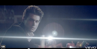
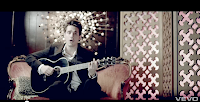
Camera Movement and Framing: Most of the frames in the performance part of the video the artist is framed on the side of the whole frame. Here are some examples of how this is done throughout the video:
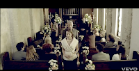
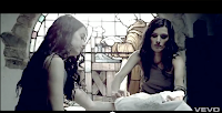 The narrative part of the video is framed differently from the artist, most of the shots are medium shots and the characters are kept quite central to the frame, whereas the artist is framed to the side. his is how we can differentiate between the narrative scenes and the performance scenes. These are some shots from the narrative scene where framing distinctively shown to be different:
 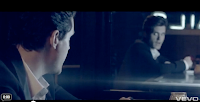 Diegesis: The story portrayed throughout the video I didn't understand straight away as I saw some of the shots from the narrative looked like the performance shots. For example this particular shot where he lip sings in the narrative as apposed to just the performance:
 We can see the story progressing through the linked shots of the church and the bar of where he is for most of the video. Towards the end of the video we see the two narratives come together at the bar which confirms the audience's view of what story the narrative was telling. Here is the shot that shows this: 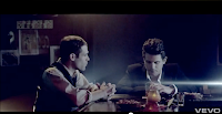

Thursday, 17 November 2011
Feedback of Magazine Advert
Above is our magazine advert, for our artist 'Nathan Vega' as his second album promotion. We got some feedback after showing it to our peers, some good feedback and some feedback on improvement of it. To improve the advert we asked what they thought about our font and the various writing on the advert. The font of the artist's name and album title they found to look quite childish, however said the colour of it was good. They also said we should change the colour of our writing for the quotes from various companies e.g. MOJO because they cannot be seen easily. Some of the good feedback we received was that the image again was excellent and they really liked all the colours the photo portrayed. With this feedback we will change and improve our advert to become better and more appealing.
Feedback of Digipak
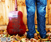
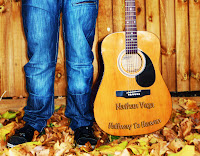
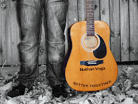

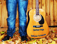
Some of the good points from feedback were that the photo itself was taken very well, also the editing was excellent. Our peers said they liked the contrast in the photo, and they also liked how the front cover was the front of his legs and guitar and the back was the back of his legs and guitar.
Wednesday, 16 November 2011
Rough cut to Test shoot
On Tuesday 25th of October we went and filmed all the shots of the main artist in our specified location. We got all the footage we needed on the day, however when we watched it back during editing we saw that the actor did not perform very well. Therefore we decided not to use the shots for our actual music video, instead we renamed the footage as test shoot footage.
From this footage we saw what we needed to improve on and how we needed to reshoot our footage. The actor's performance in particular was what we felt did not go well, we talked about it and we came up with a few points on what we could tell him to do better to improve the shots. He needed to accentuate his lips when singing so it was more obvious he was singing, also needed to show some emotion when singing he looks too fixated or looks like he is day dreaming. Another issue was the guitar playing, it is very bad as you will be able to see in the footage below. To resolve this, we looked on youtube for the chords of the song and we are going to try and help the actor play the guitar a bit better. When we got feedback we were told we should use a guitar pick which would make it easier for him to play the guitar, they also agreed on points that we thought needed improvement on. Below is our test shoot footage put together to give you a little insight to how part of our music video would look.
From this footage we saw what we needed to improve on and how we needed to reshoot our footage. The actor's performance in particular was what we felt did not go well, we talked about it and we came up with a few points on what we could tell him to do better to improve the shots. He needed to accentuate his lips when singing so it was more obvious he was singing, also needed to show some emotion when singing he looks too fixated or looks like he is day dreaming. Another issue was the guitar playing, it is very bad as you will be able to see in the footage below. To resolve this, we looked on youtube for the chords of the song and we are going to try and help the actor play the guitar a bit better. When we got feedback we were told we should use a guitar pick which would make it easier for him to play the guitar, they also agreed on points that we thought needed improvement on. Below is our test shoot footage put together to give you a little insight to how part of our music video would look.
Saturday, 12 November 2011
Inspirational Video
This video 'Who Says' by John Mayer inspired us too include still images of our music video into the actual video. We want to try to create the same effect as the video does when they include the still images. We are also going to try and create a tint on some parts of our video, we feel this video expresses what we want to do the best.
Friday, 11 November 2011
Filming
Today we filmed the girls part of the video, most of the narrative. The location was at Devki's house, we used her bedroom as the girls bedroom, and we were able to shoot some good footage which we will be using in our rough cut and hopefully final version. We decided to shoot extra footage so that we would have enough to edit and for back up. The shoot went really well.
Thursday, 10 November 2011
Rough Digipak Front and Back
These are our rough digipak design's, we used photoshop to edit them. Once we had the basis of our digipak we tried out different fonts and colours to see which one looked the best. Once we had all our different versions we asked our peers for some feedback on which one looked the best. They all said that the front with the black font looked the best, however they said we should change the colour of our track list as it was quite hard to read (as you can see above).
Original photo used for digipak
These were the original photo's we used for our digipak, we edited both of these using photoshop on the mac.
Wednesday, 9 November 2011
Monday, 7 November 2011
Inspiration for our Digipak
'Born in the U.S.A' is one of the album's by Bruce Springsteen. This album cover was part of our inspiration for our own digipak cover. When we saw this album cover we didn't think we would do this, but when we were thinking of ideas for our digipak we took this picture and felt that it went well with our artist and genre.
Subscribe to:
Comments (Atom)


