Dear Moderator,
Thank you for viewing all my work and progress throughout the project again. I have highlighted the improvements made to my blog, ancillary tasks and music video. To view all my improved work, I have created an 'improved' label which can be found on the right, in my cluster of labels. I hope you enjoy my new and improved work. :)
Shreyaa Pattni
Thursday, 10 May 2012

Improvements and feedback
Improvements in relation to my ancillary tasks:
One of the changes I made to my digipak was, the colour and font of the track list on my back panel. I felt this needed improving as it looked quite hard to read at a glance, therefore I decided to make the size of the list bigger so it was easier for my audience to see. I also changed the colour by making it slightly lighter, again so the audience would be able to read the track list with ease. I made the font size of the album name and artist bigger, to make it stand out on the front cover of my digipak.
Another change I made was to the inside panel of my digipak. The original was the collage of pictures of our artist from the shoot of the single 'Better Together'. I felt that this needed to be changed because it didn't look professional, and much of the artist was already revealed through the music video in the behind the scenes footage. Instead of the collage, I decided to have a picture of our featured couple, holding hands, however I only used their hands, this is because I wanted to emphasize the idea of relationships throughout this album. I edited the picture, by blurring the grass to put more focus on the hands, and also adding a slight sepia tone tint to the image to try and fit it in with the slightly orange/autumn colour of the digipak.
Improvements in relation to my music video:
0:15-0:20: We swapped the previous behind the scenes clip for a different one, this was because we found the prior clip mislead people watching it, as they thought the lip sync was off because they saw the artist moving his lips. However it was not off sync, the clip showed the artist talking in one of our behind the scenes clip, but ot avoid this misconception we decided to change the clip altogether.
0:42-0:45, 1:02-1:05, 2:08-2:10, 2:32-2:33: At all these points in our music video we included new footage of another couple who are in a loving relationship, instead of the original still images we had. We did this because we felt that with the nature of the song being about relationships, automatically you (the audience) would think about couples and different relationships.
1:02-1:05: We used this clip to replace the original freeze frame of our behind the scenes clip, because what we tried to achieve with the still image changing into a moving image did not work therefore we chose to replace it with our loving couple.
1:34-1:38, 1:47-1:51: These shots show the relationship between siblings, we felt we should include different relationships so that a wider audience could relate to the song when watching the video, these were also used instead of the still images in the original cut. The reason we chose to jump cut these shots was because we wanted to editing to flow, as there are also a few jump cuts of our artist at 2:23-2:27.
Feedback of music video:
Most of the feedback we gathered from our peers, was focused on the new footage we included. They enjoyed watching the two different types of relationships, and linking it to the song. Many people emphasised the fact that the new footage was better compared to the still images used in our previous version of 'Better Together'. They also told us that the way we edited the footage between the two siblings was effective with the beat of the song, and also kept the mood of the video uplifting and allowed them to laugh and smile at the loving moments of the other couple. Overall, the continuity of the narrative of the song was better established in this version compared to the other version, as our peers felt they could relate to the meaning of the song better with the new cut.
Feedback of music video:
Most of the feedback we gathered from our peers, was focused on the new footage we included. They enjoyed watching the two different types of relationships, and linking it to the song. Many people emphasised the fact that the new footage was better compared to the still images used in our previous version of 'Better Together'. They also told us that the way we edited the footage between the two siblings was effective with the beat of the song, and also kept the mood of the video uplifting and allowed them to laugh and smile at the loving moments of the other couple. Overall, the continuity of the narrative of the song was better established in this version compared to the other version, as our peers felt they could relate to the meaning of the song better with the new cut.


Friday, 9 December 2011
Evaluation Task 1 - In what way does your media product use, develop or challenge forms and conventions of real media products? (i.e music videos)

(Numbering left to right)
1. This shot shows the relationship between the lyrics and visuals. It does this by showing the couple sharing a loving moment with the audience, whilst the lyrics read 'Its always better when we're together.' This portray's the link between the visuals and lyrics to the audience clearly.
2. This shot display's how the record company would want the artist to be represented. It does this by showing the artist is comfortable in a natural environment, we can see he is comfortable by the way he is holding the guitar. The guitar is also displayed on his album cover and magazine advert, which are also in natural surroundings, which appeals further to the record company, Brushfire Records.3. We can tell what type of music genre is being displayed in this shot as the acoustic guitar is the main aspect of the frame. Also his clothes suggest the genre is soft rock as they are casual and simple.
4. This particular shot of the guitar shows intertextual reference to James Morrison's video 'You make it real'. This close up of the artist playing the guitar, shows that the artist has talent and plays it throughout the video.
5. This close up of the artist singing shows good use of camera as we created this shot by using a low angle on the artist so the audience would stay focused on his expressions and singing.
6. This shot focuses on the lighting, we used a lamp and the actual main light in the bedroom to make it brighter. We also opened the curtains and used an tall powerful light that made a big difference to the shot. this shot is where the sun fades into the light bulb into the bedroom scene.
7. The mise-en-scene in this shot links with the genre again as the setting is all natural and we can see all of him showing him in casual clothes, emphasising how simple the genre and he is.
8. This is a shot from one of Jack Johnson's videos. This is a similar shot to shot number 4 as it is a low angle and is focusing on himself rather than the surroundings. Also this shot is a behind the scenes shot, we also include many behind the scene shots of our video. This was an inspirational shot.
9. This is taken from the music video called 'who says' by John Mayer. This shot is a picture of him and friends, we tried to replicate this affect by putting in still images into our video with our artist in it.
Evaluation Task 1 - Part Two

2. Here we can see the artist playing the guitar in what seems to be his home, his body language suggests he is quite relaxed whilst playing the guitar. This implies he is a very laid back 'down to earth' guy which fits with the record company.
3. This shows the music genre by the acoustic guitar being played by the artist and the microphone in whilst he is singing into. These are the only props or instruments being used, which we can infer from that it is a specific music genre.
4. This close up of the artist singing into the microphone shows intertextual reference to other similar genre music videos as it aims to show emotion of the song coming from the artist.
5. This extreme close up of the artist frames him in the centre of the shot and also blurs the background so the audience can see the artists face whilst he is singing. They can see the emotion from the song and this gives the shot a personal touch as the audience would feel he is connecting directly with them.
6. The video for 'Broken Strings' is shot a a hotel room. This establishing shot shows that the room is well lit and we can clearly see everything in the room. This shot aims to create a reflective shot to then show the female artist on the other side of the room.
7. This is another shot from the video 'You make it real' by James Morrison. This shot shows good mise-en-scene in perspective with the meaning of the song. The shot looks gloomy and grey representing sadness, also the artist is sitting alone on the stage this shows that he feels lost.
8. This is one of our inspirational shots, this is of James Morrison again from the video 'Broken Strings'. He is framed to the side of the shot however it is still a close up of him. We did this in our video as well from 0:12-0:15 he is framed to the side of the shot and it is a close of him singing the first verse.
9. Another inspirational shot here is from John Mayer's video 'Waiting on the world to change'. This shows a partly frontal and side view of the artist, we created a similar shot of our artist from 0:58-1:02. The camera is focusing on the side of his face however we are still able to see part of the front of his face.
Evaluation Task 3 - What have you learned from your audience feedback?
Positive Feedback of our music video:

Negative Feedback of our music video:

Positive Feedback of our Digipak and Magazine advert:

As we have improved the inside panel of our digipak comments from 3:04-3:22 do not reflect our new digipak feedback. Once we improved our digipak the feedback we received was that it looked more professional and that the inside panel of the hands, linked with the single we were promoting from the album, 'Better Together'. People also felt that a bigger and bolder font for the front cover made it more obvious to who the artist was and the name of the album, they also liked the fact that they could see the spine much more clearly.

Thursday, 8 December 2011
Saturday, 3 December 2011
Friday, 2 December 2011
Magazine
When I created this magazine advert I made sure I used the same effects as I did with the digipak. This is so you can clearly see the link between the two.


Digipak
This is the second version of the digipak. I created another version because I wanted to see if my audience preferred the first version or the second one. This particular digipak links with our magazine advert also. I used the same piture for both the magazine advert and the digipak, as I found that many other artists do this when promotoing their album. Also on the firstone we did we didnt link the digipak and magazine advert picture. By using our audience research we will determine which will be the final one.


Final Digipak - 4 panel

This is my final digipak. I decided to keep it as four panels. The front cover is a photograph of the artist playing his guitar which is simple yet effective as it enables the main focus to be on him. It also portrays his passion for music and his guitar. Using Adobe Photoshop I added a 'cutout' effect onto the image, which gave was able to enhance the colours. I kept the fonts very simple to represent the artists character and genre of music and also so that it was clear and readable. The bottom right panel is where the CD will be placed. We thought this fit in well with the shape of guitar. For the left inside panel we decided to place a photograph of a couple holding hands to signify togetherness. The couple used for the photograph also feature in our video.
Photographs for Digipak
Wednesday, 30 November 2011
Editing in final cut express


The top screengrab shows how we made some of the shots black and white, specifically in the behind the scenes shots in our video. The other two shots show how we created the light bulb and sun effects to merge them together when we faded to the bedroom, scene of the girl.
Sunday, 27 November 2011
Thursday, 24 November 2011
Filming
Today we went filming again, we re-shot the park scene as the performance was not good in our previous shoot. We got all the shots we needed and we also included the end of the narrative scene in it as it was in the park. The weather wasn't as good as our previous shoot of the park scene, however I think it will fit in and not cause a problem for our video.
Saturday, 19 November 2011
Vernallis analysis of a music video
I chose to analyse this particular music video because it was one of the many videos that inspired many of our shots in our final cut of 'Better Together'.


 These two shots in the narrative sequence show that he hasn't gone to his wedding and the people at the church are now packing up. There are various transitions between the bar scene and the church scene. The narrative cuts between the performance and the different narrative scenes.
Editing: This shot on the right shows the artist playing the guitar in the video, this is towards the beginning of the song, this shot corresponds with the music as there is a guitar piece at the beginning. This second shot of his performance on the left gives us a clearer view of him as the artist, but however still keeps a sense of the character as he is wearing the same clothes. The editing keeps a good flow of continuity as we always see the artist singing every part of the song as well as the cuts to and from the narrative part. However in one of the bar shots we see him singing in what we think should be the narrative which can confuse the audience to which part is the narrative and performance.


Camera Movement and Framing: Most of the frames in the performance part of the video the artist is framed on the side of the whole frame. Here are some examples of how this is done throughout the video:

 The narrative part of the video is framed differently from the artist, most of the shots are medium shots and the characters are kept quite central to the frame, whereas the artist is framed to the side. his is how we can differentiate between the narrative scenes and the performance scenes. These are some shots from the narrative scene where framing distinctively shown to be different:
  Diegesis: The story portrayed throughout the video I didn't understand straight away as I saw some of the shots from the narrative looked like the performance shots. For example this particular shot where he lip sings in the narrative as apposed to just the performance:
 We can see the story progressing through the linked shots of the church and the bar of where he is for most of the video. Towards the end of the video we see the two narratives come together at the bar which confirms the audience's view of what story the narrative was telling. Here is the shot that shows this: 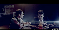

Thursday, 17 November 2011
Feedback of Magazine Advert

Subscribe to:
Posts (Atom)